DCU Orientation
Event Design | Art Direction
Approach
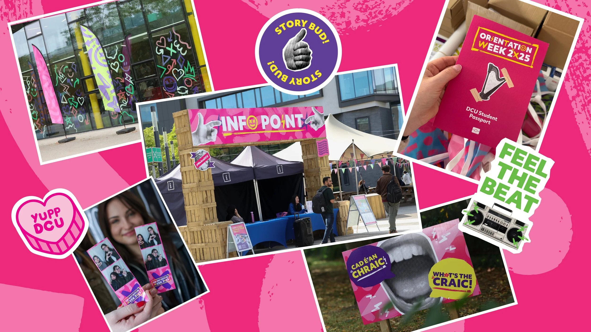
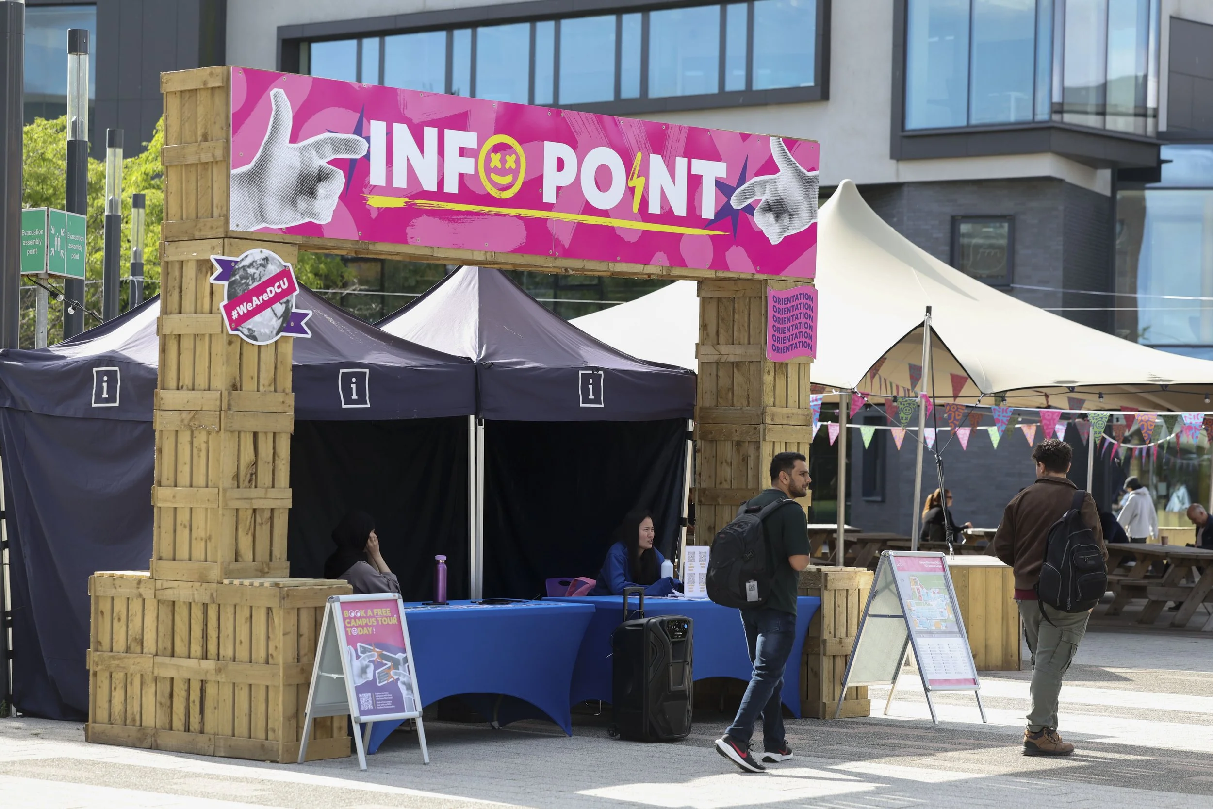
While past orientations prioritised creating a friendly environment within strict brand adherence, conversations with the DCU Students’ Union revealed a clear opportunity to evolve and deliver a more engaging, exciting experience.
This inspired a bold design strategy, allowing us to pivot away from rigid brand guidelines toward establishing a creative, high-energy environment that was free to play with visual conventions. This design was articulated across three core elements:
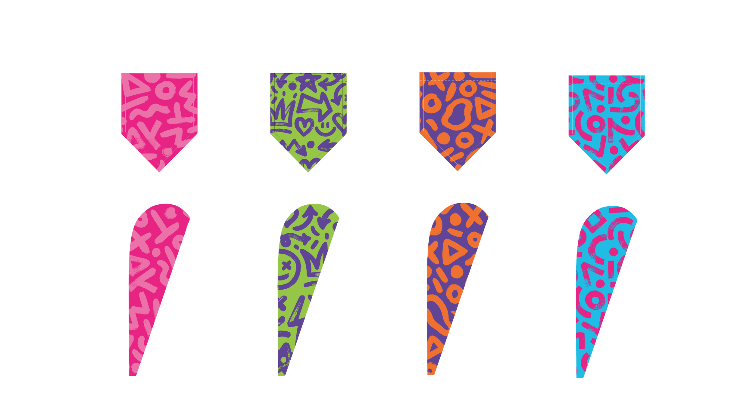
Colour
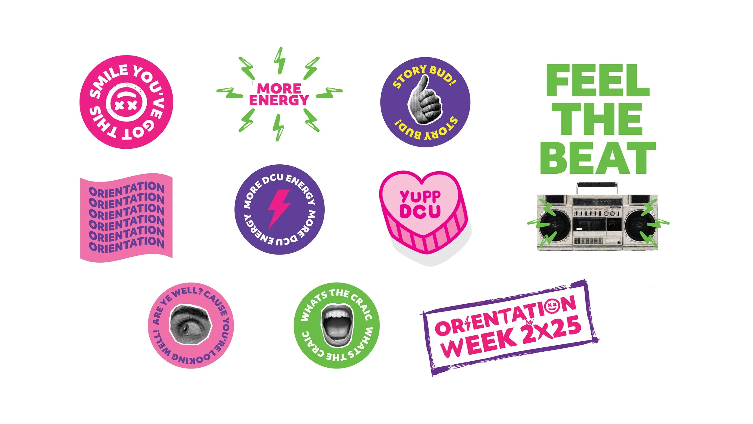
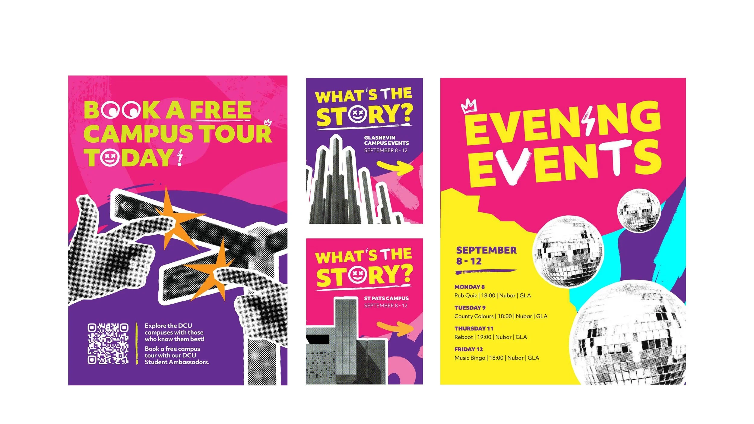
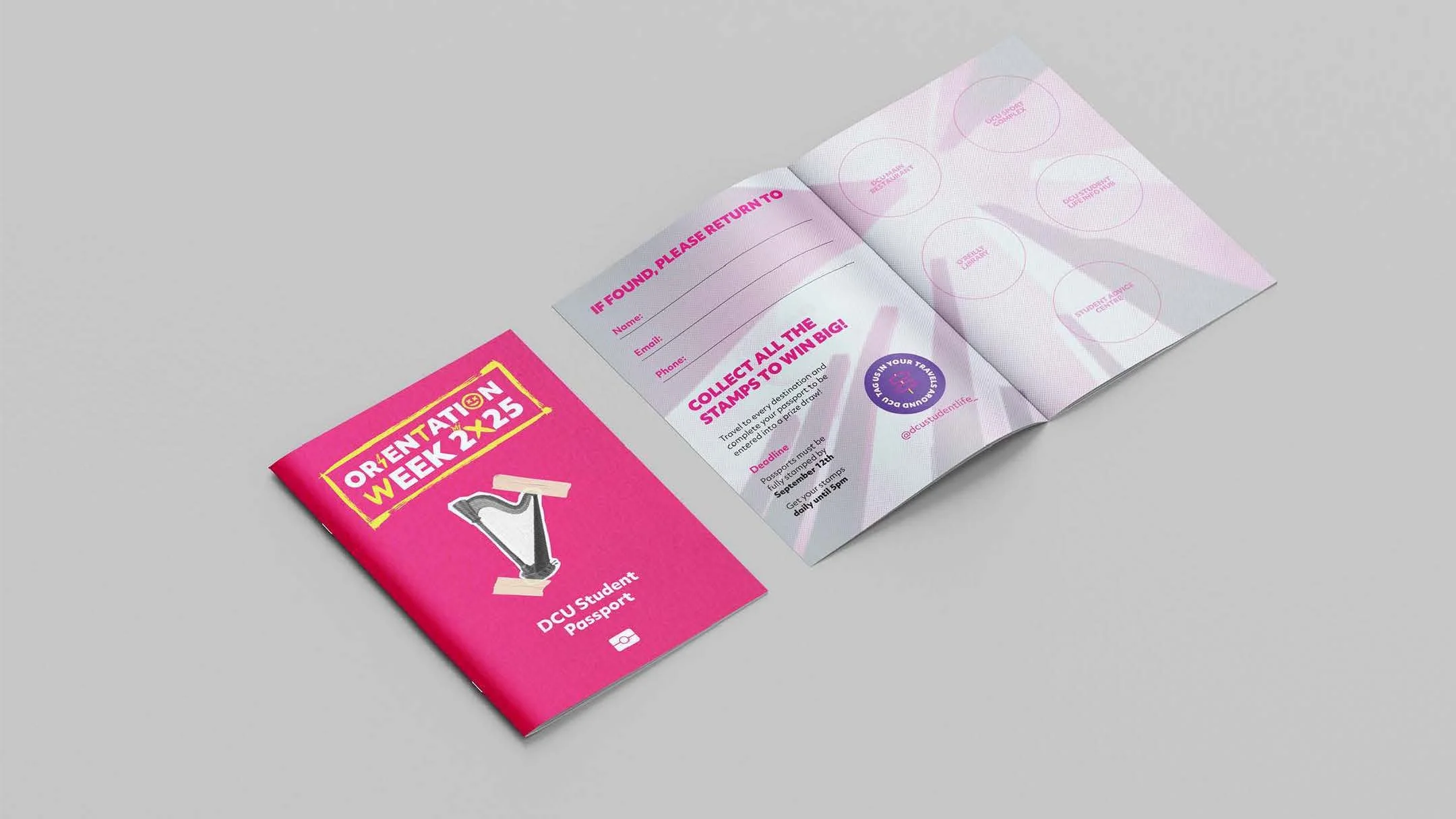
Our research phase began with analysing a number of visual trends such as contemporary musical events, festivals, concerts, and EDM aesthetics, this allowed us to understand what was resonating with the target demographic and create a vibrant, energetic colour palette.
Graphics/Patterns
The graphics utilised a cut-out, spot colour technique to intentionally invoke a notebook or zine-like sensibility.
Awards
2026 Event Impact Award - Finalist
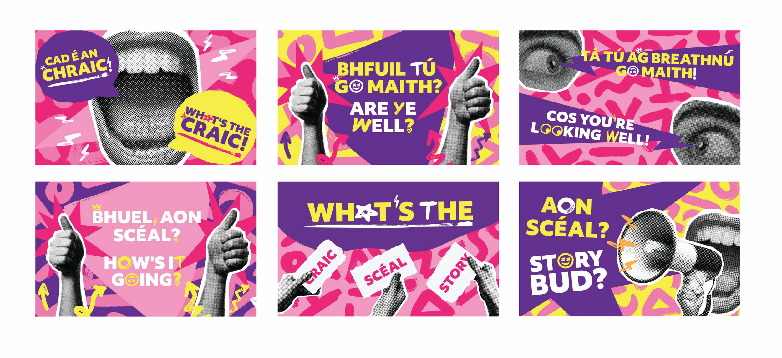
Communication/Language
By adopting contemporary Irish slang as the primary form of communication, we designed a campaign that students could instantly relate to and connect with. This specific tone of voice encourages authenticity, creating an open and non-judgmental atmosphere that prompts students to be themselves and fully engage.