
Airbuy
UX/UI
Airbuy is a conceptual mobile booking app developed for my UX Diploma. While most travel sites feel like cluttered marketplaces, Airbuy is a calm, fast, and intuitive travel assistant designed to get users in, booked, and on their way.
-
Streamline the Flow: Reduce the number of steps from "Search" to "Confirmation."
Prioritize Clarity: Present the most relevant flight data (price, duration, stops) without visual clutter.
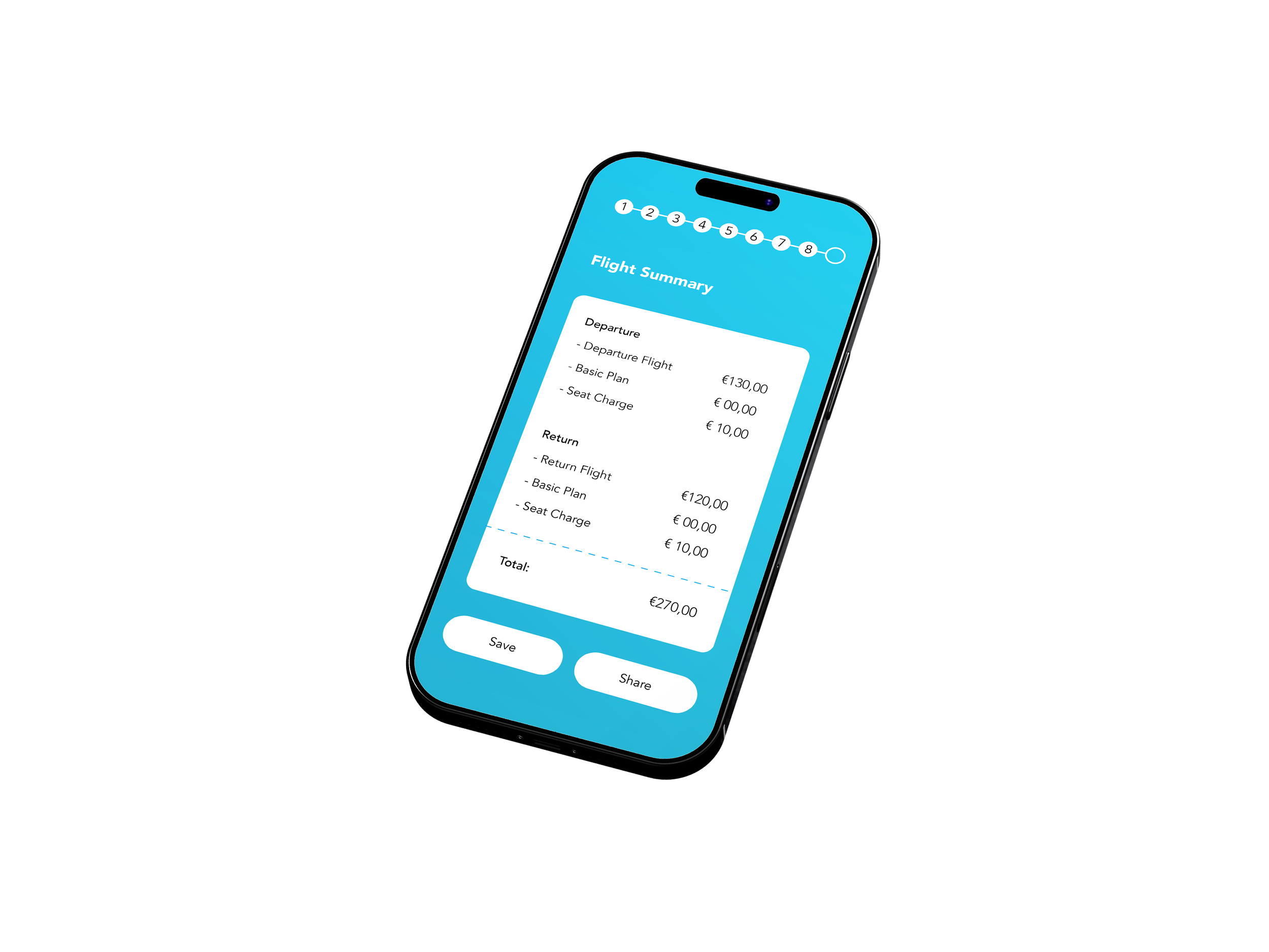
Build Trust: Show the final price upfront—no "hidden fee" surprises at checkout.
-
The Noise: Users are forced to navigate aggressive ads and hidden "add-ons."
The Friction: Overwhelming layouts make it difficult to compare flight times and total costs quickly.
The Goal: How can we strip away the chaos to create a "one-handed" booking experience that feels effortless?
The Process
To ensure every design decision was backed by data and user needs, I followed a structured End-to-End UX Process. This prevented me from jumping straight into visuals and instead allowed me to build a foundation based on real human problems.
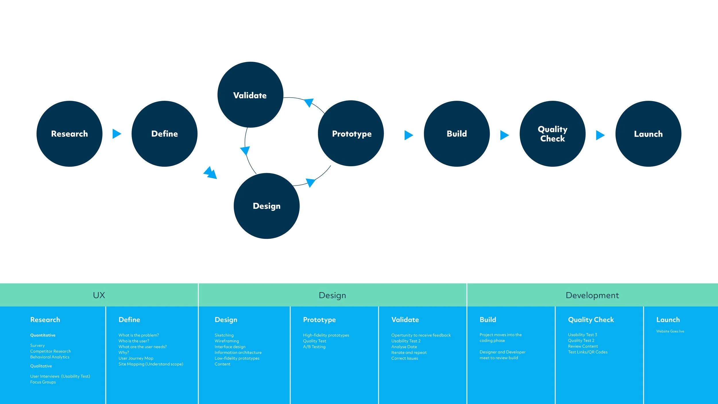
Research
Competitive Benchmarking
The research began with a deep dive into the current industry landscape. My goal wasn't to replicate what exists, but to identify friction points and ask: “How can we improve the status quo?” and “What is missing from the current user experience?”
To get a global perspective, I looked beyond local carriers to analyse how top-tier airlines across the world handle complex booking flows. Examples can be seen below.

Define
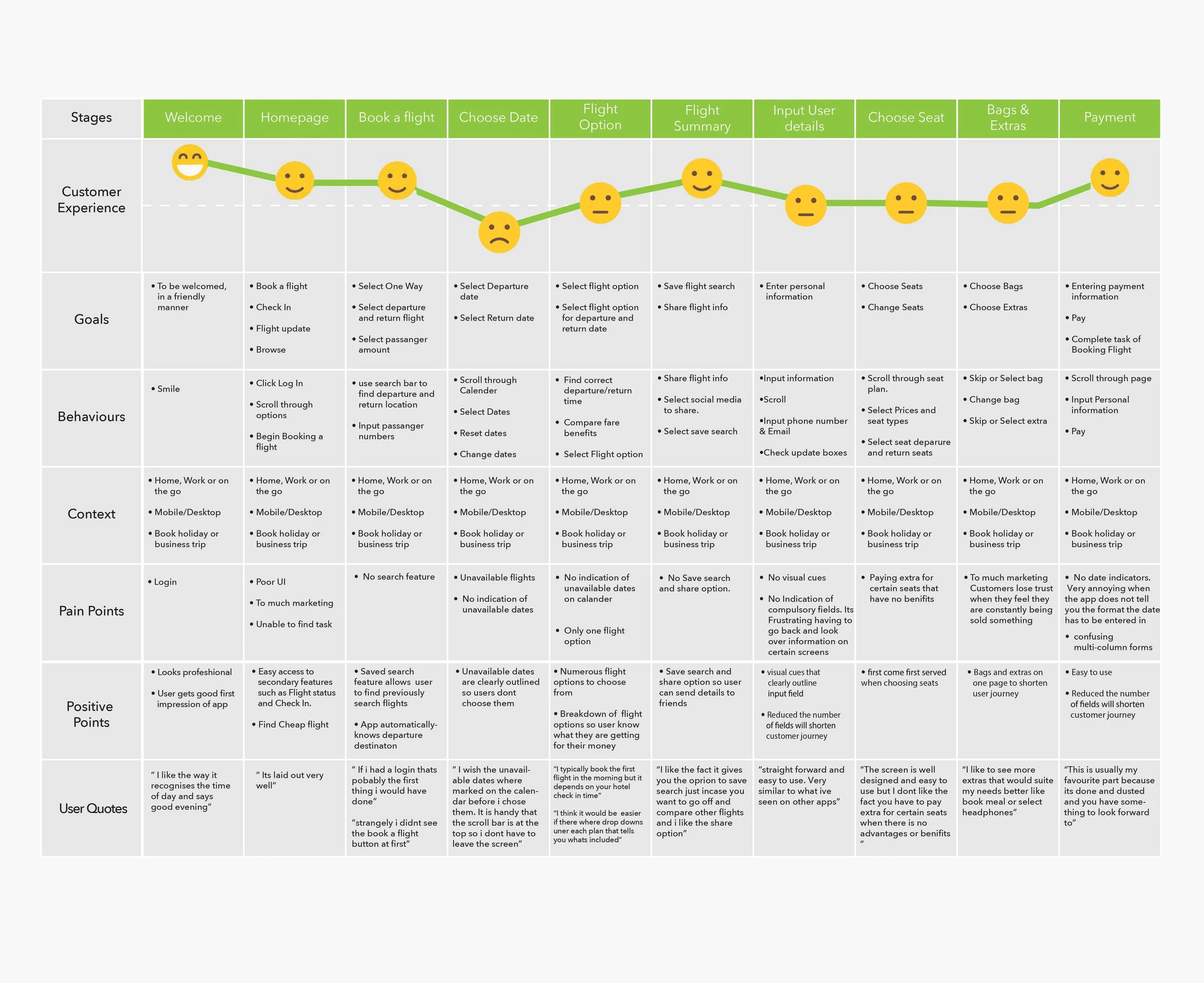
Customer Journey Map
A journey map is a diagram that combines both process and experience. It outlines the steps a user will take and what they feel throughout the process. It is extremely useful, helping the designer to identify pain points, build empathy, find opportunities and Visualize solutions.
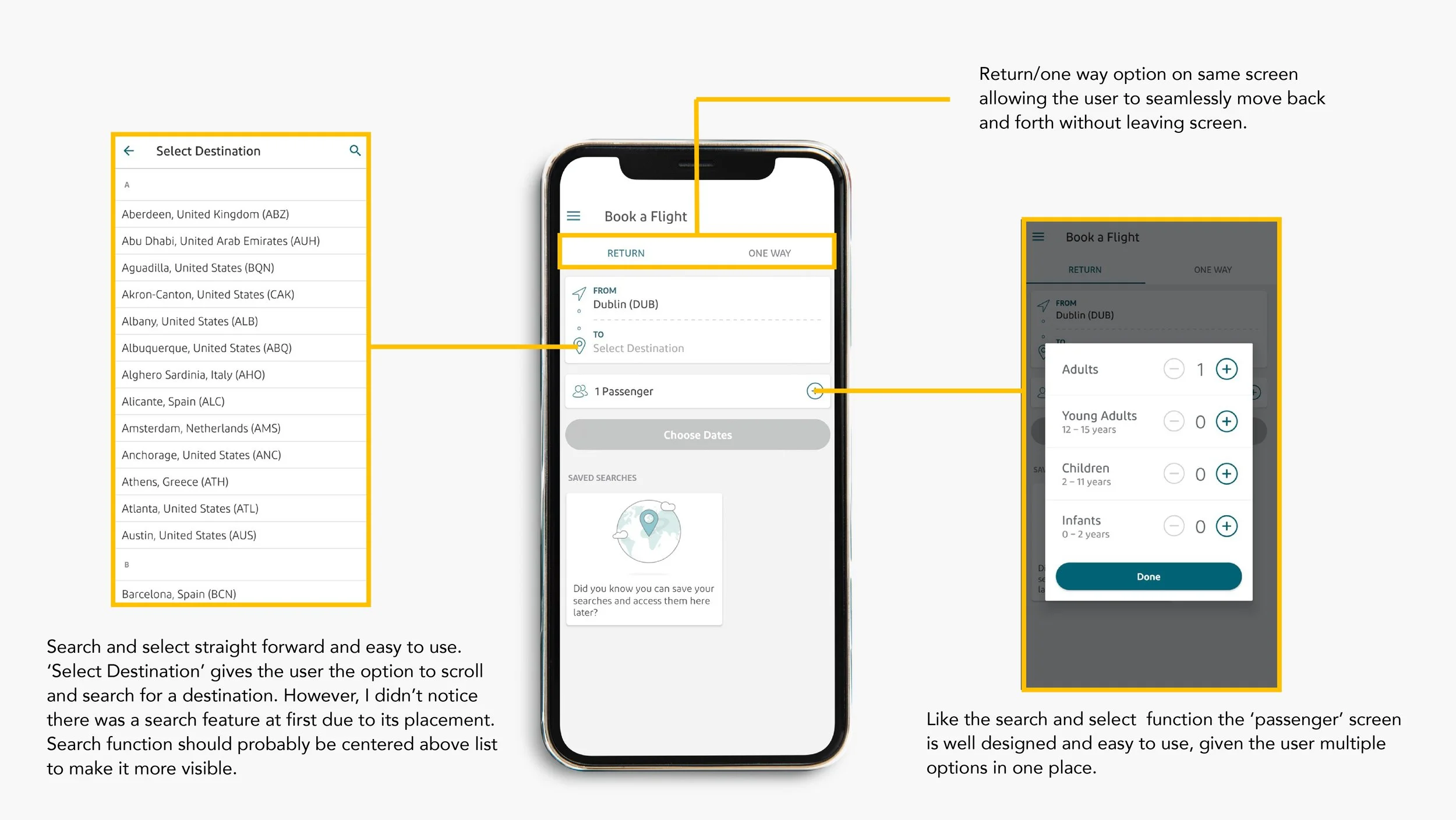
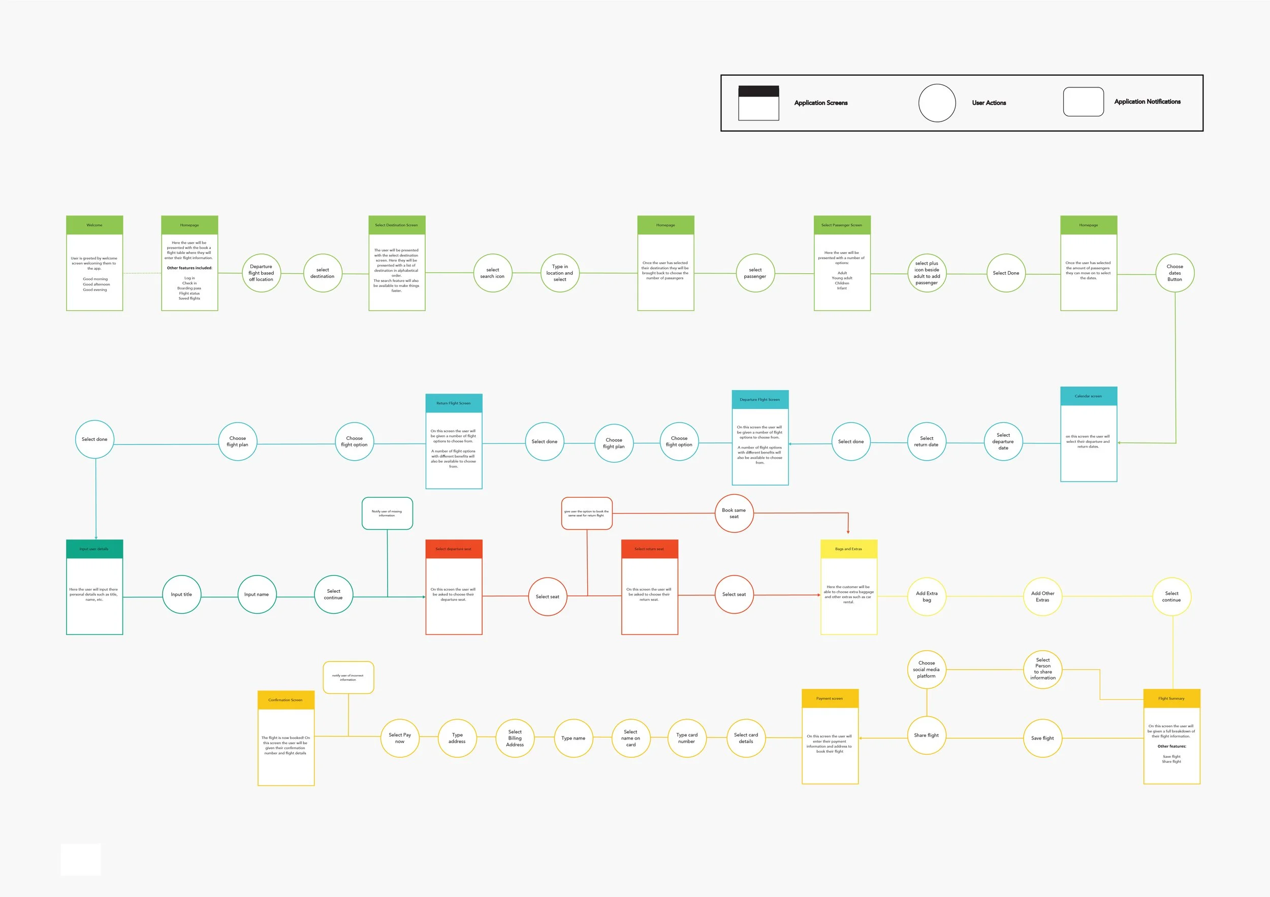
User Flow Diagram
A User Flow is a visual map that shows the step-by-step movement through your app. It starts when the user enters the app and ends when they reach their goal. It allows as the designer to simplify the path, avoid dead ends and gives and overview of the number of clicks it takes the user to reach their goal.
Design
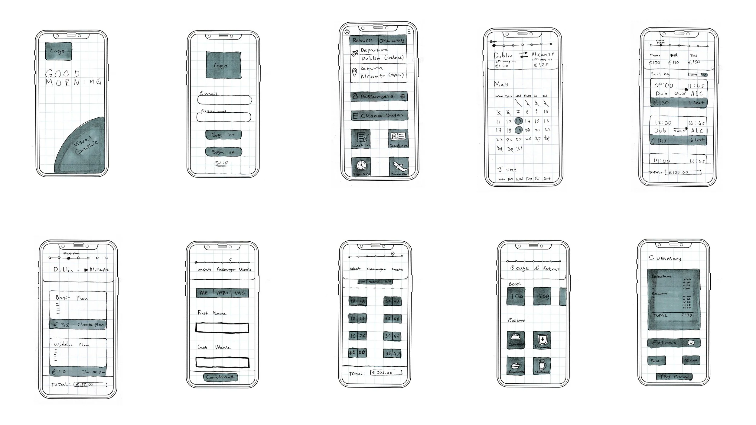
Low Fidelity Prototype (Sketch)
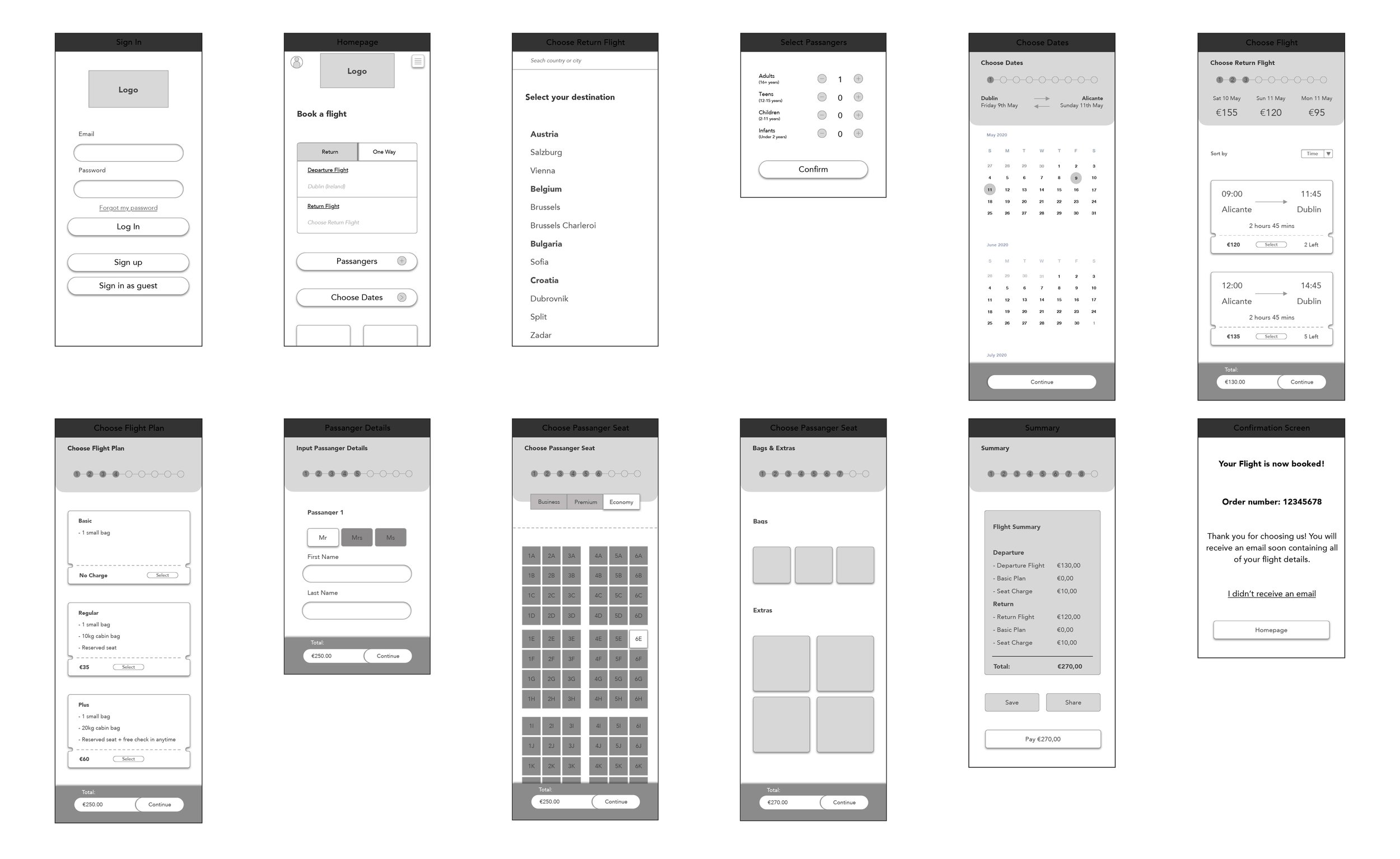
Medium Fidelity Prototype

User Interface
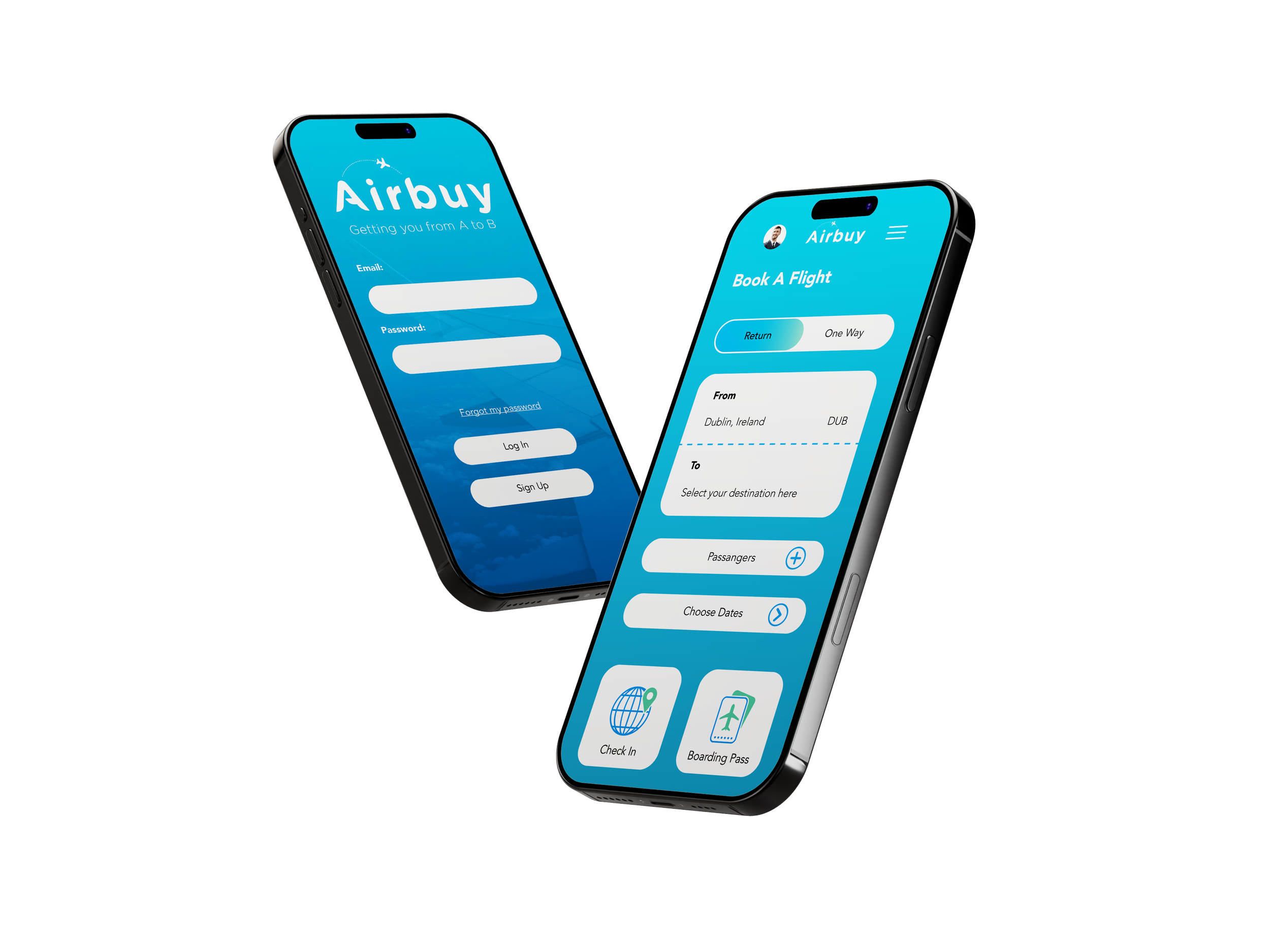
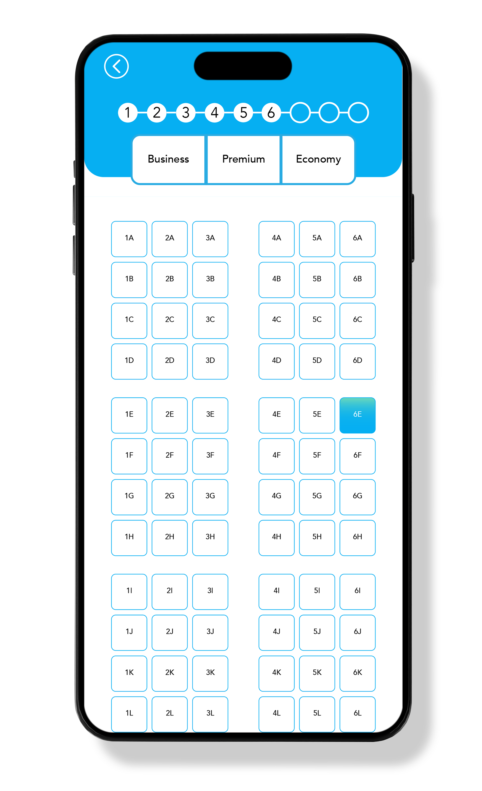
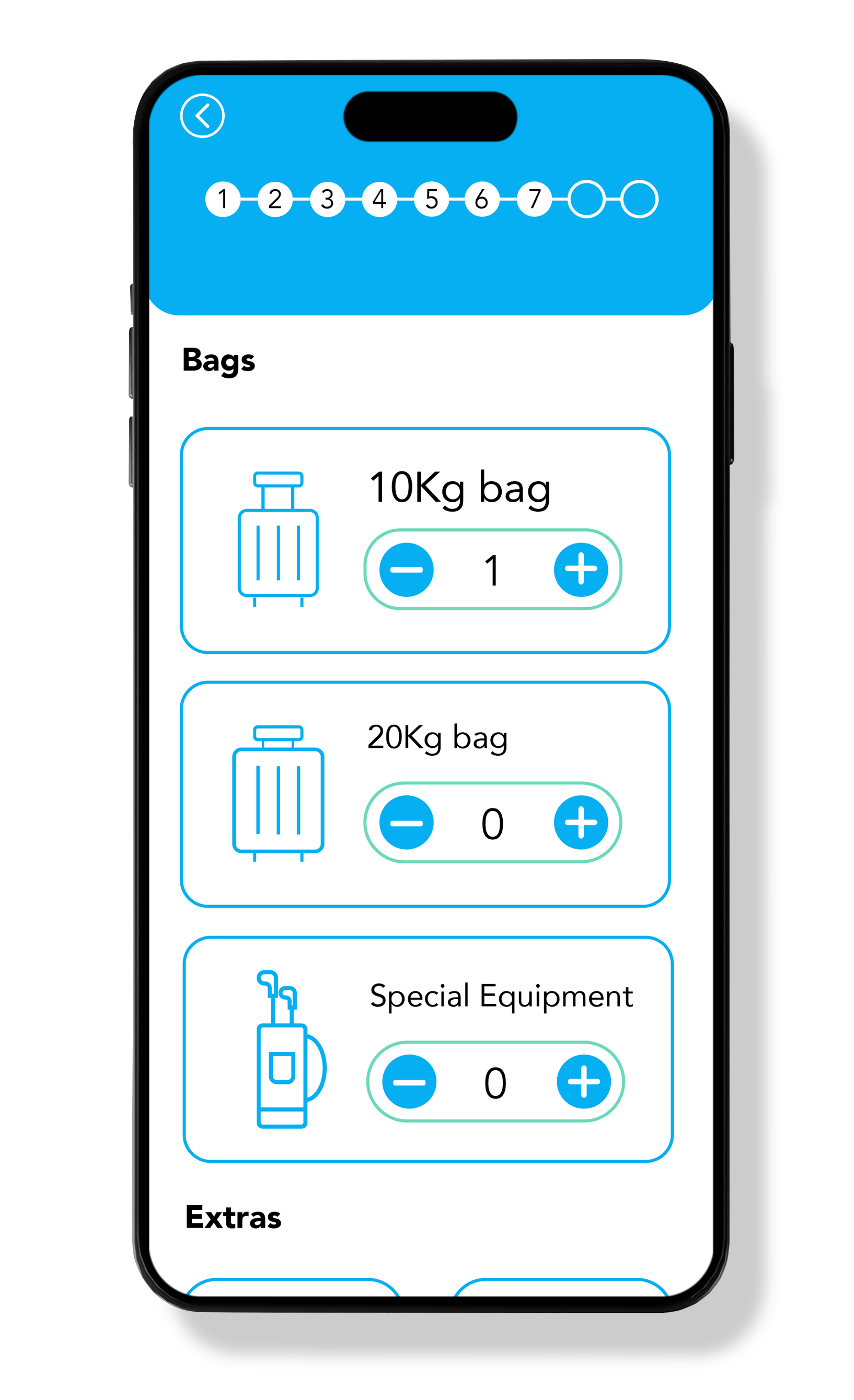
Airbuy’s sophisticated deep-blue palette created for the interface moves away from the high-contrast, primary colours often associated with low-cost carriers. This choice establishes a premium visual look and feel, which gives a sense of reliability and prestige.
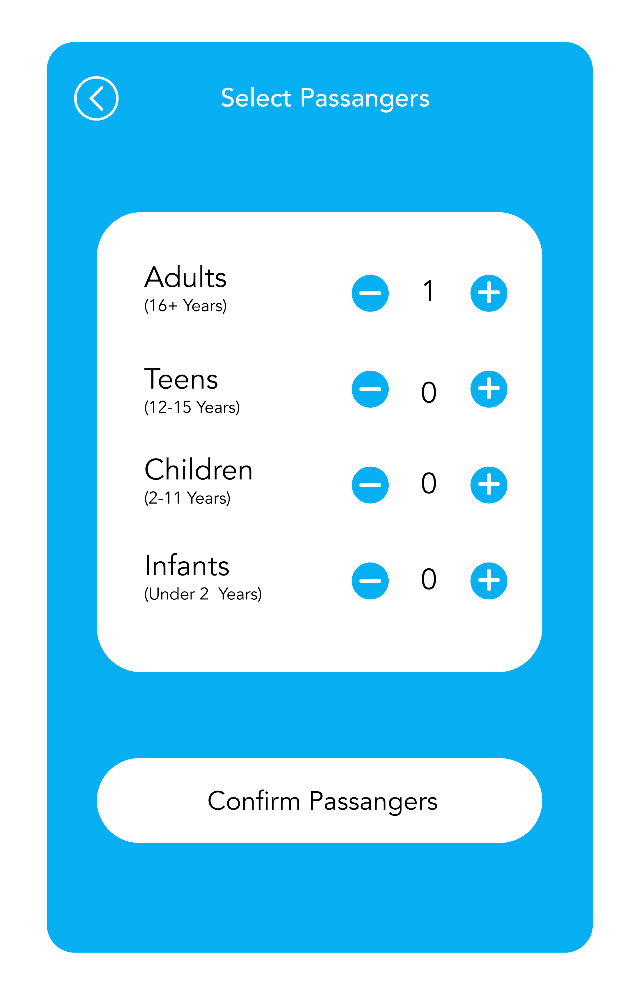
The UI is engineered with a mobile-first, user-centric approach, Key features include:
Optimised Touch Targets: We’ve implemented expansive touch points to ensure high accuracy and reduces errors.
The "Thumb Zone" Architecture: By placing critical navigation and call to action elements within the lower two-thirds of the screen, as seen on the homepage, we facilitate a seamless one-handed booking experience.
On-the-Go Efficiency: Recognising that users are often in-transit while booking, the interface minimises cognitive load through a linear, frictionless checkout flow.
Seamless Transitions
Rather than a series of disjointed screens, each section fluidly transitions into the next. This creates a logical, linear progression that maintains user momentum. The result is a consistent, high-velocity experience that transforms a complex logistical task into a positive, stress-free interaction.
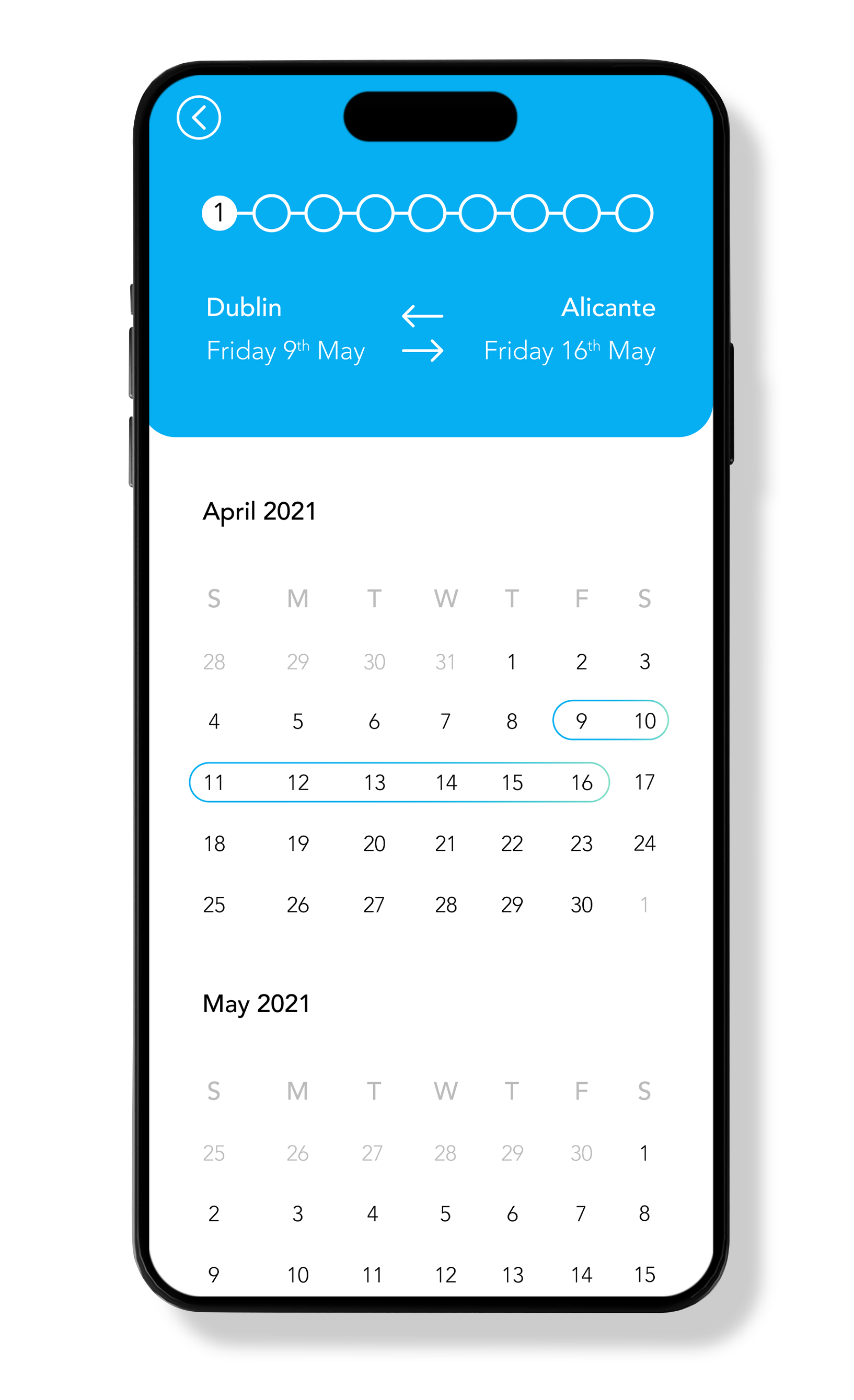
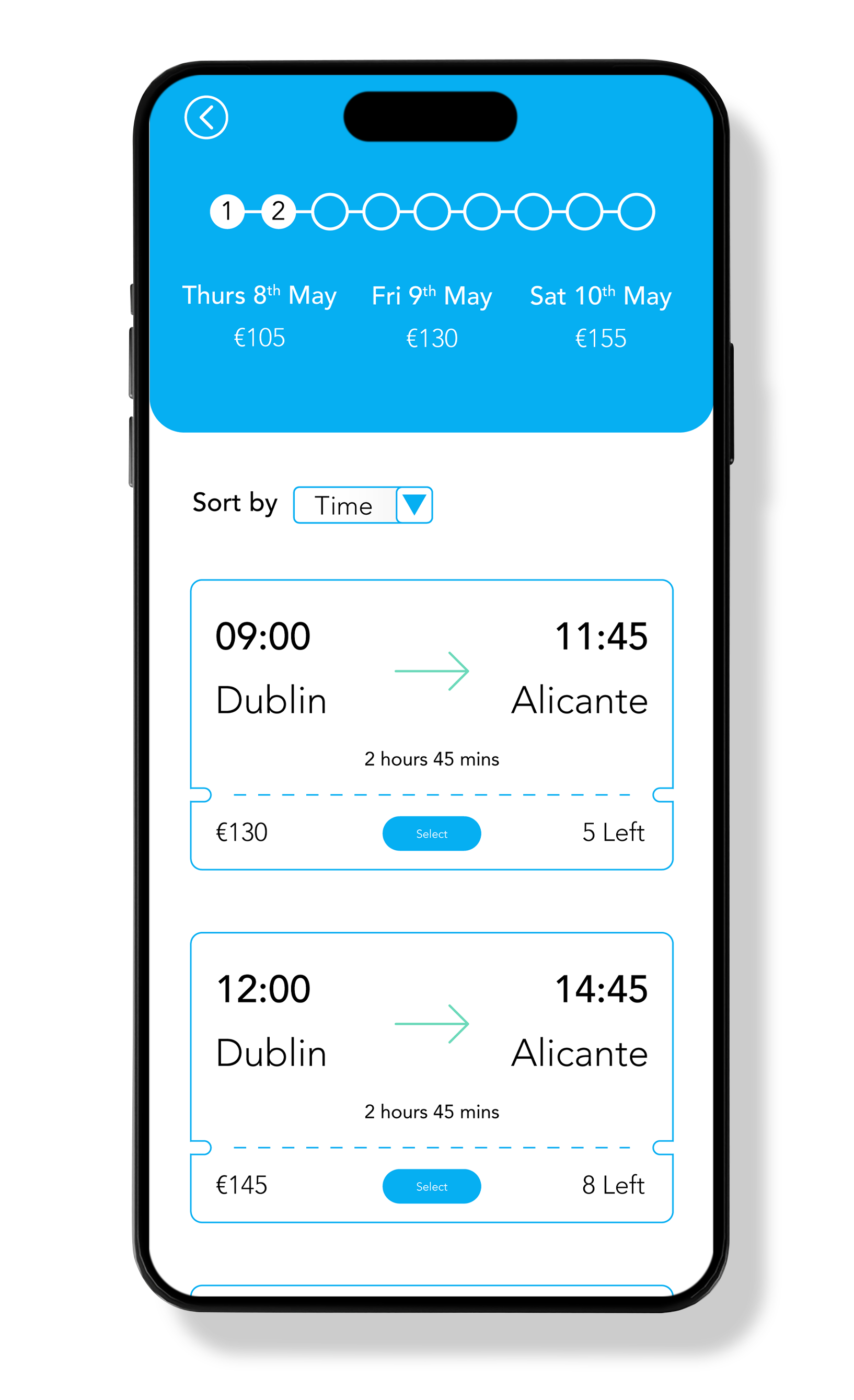
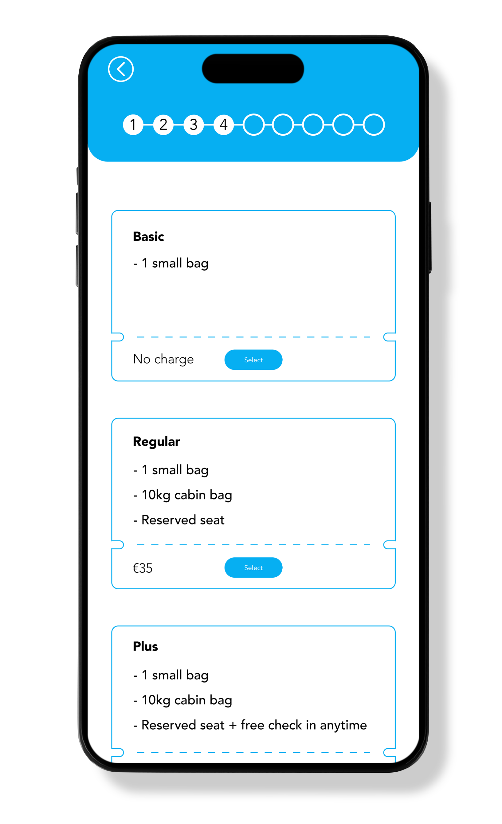
Navigation
The navigation architecture adopts a no-nonsense model, prioritising task completion over aesthetic fluff. By stripping away the traditional clutter of budget travel interfaces, we’ve created a path to purchase that is both intuitive and lightning-fast.
Process Transparency: Users are never left guessing their progress. Throughout the user journey a breadcrumb system sets clear step-indicators, providing the user with constant contextual awareness. This high level of transparency reduces drop-off rates and allows the user to feel in control of their journey from discovery to checkout.
Summary
Ultimately, this app is designed to prove that booking a flight doesn't have to be a headache. By combining a high-end look with a straightforward layout, we’ve built an experience that respects the user’s time and makes the process feel effortless. We’ve cut out the clutter and focused on what really matters: getting the user from start to finish with zero frustration. The result is a fast, reliable, and accessible tool that makes "budget" travel feel like a premium service.