The Spark
Brand Identity
The Spark is a digital learning hub based in Dublin that is designed to demystify emerging technologies. It focuses on the transition from traditional workflows to digital/immersive environments through hands-on experience (hackathons, VR/AR, and challenge-based learning).
-
Create a visual identity in which digital elements feel grounded and physically present within their surrounding space. The system should translate seamlessly between screen and print, appearing just as natural on digital platforms as on physical assets such as posters and decals. Use vibrant, welcoming colours that convey energy, warmth, and movement.
-
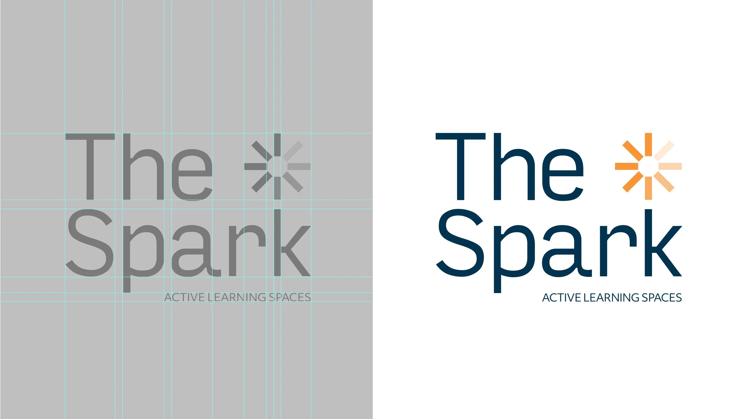
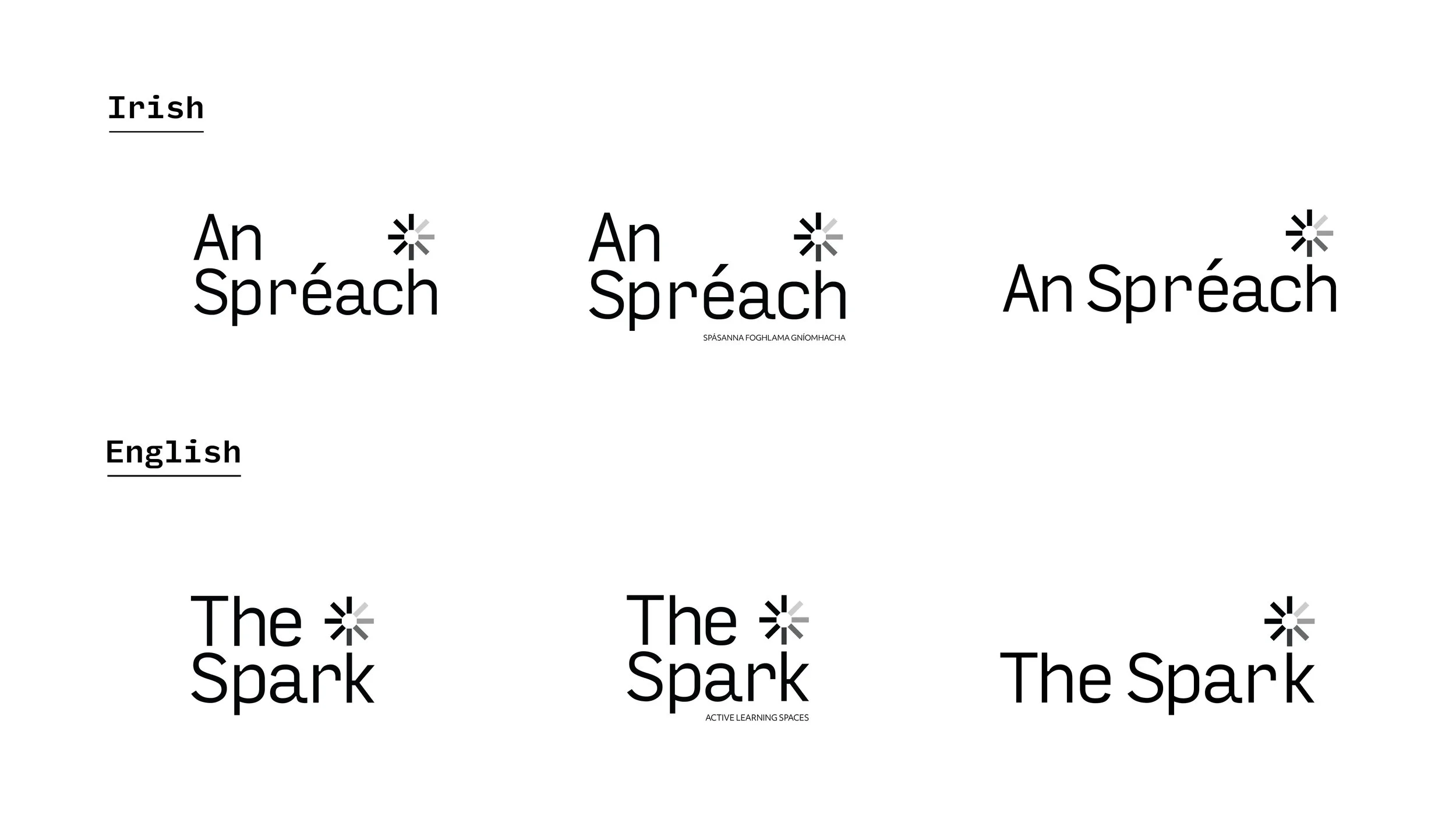
Weight and Balance: You must ensure that the Irish language (Gaeilge) is not treated as a secondary "subtitle." Achieving typographic balance between two languages.
Naming convention: While the name naturally suggests a literal ignition point, our challenge was to move beyond the visual cliché of an electric spark. We pivoted the strategy toward a more conceptual representation of activation,

Early Concepts
Concept 1
How does an idea first start its journey after the spark of an idea ignites in the human mind?
With Pen and Paper.
The spark you see alongside the text was hand drawn giving the identity a more artistic look and feel which also represents Growth and Learning.
The lines reach out from the centre point which gives the impression of a mind map which can also represent creative thinking.
Concept 2
The Spark, an advanced learning space that goes beyond conventional teaching and learning, with the main focus being on providing a creative space that will inspire new ideas, allowing people to think and work differently, create without limits, and thrive in an unscripted future.
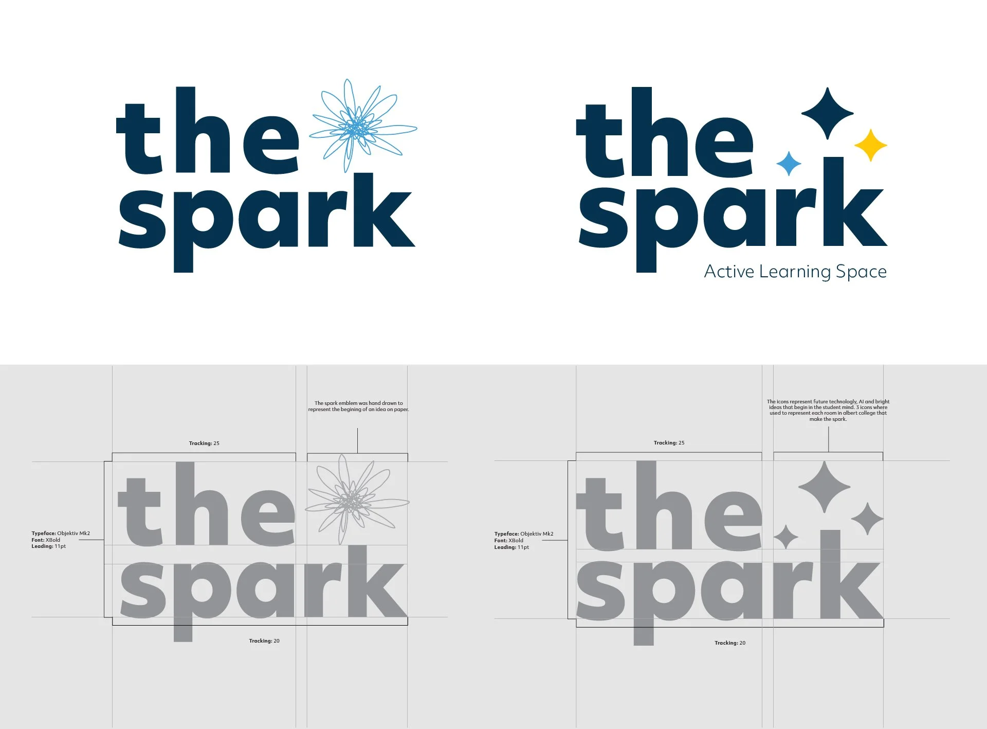
Final Concept
Initial explorations leaned heavily on the literal notion of a spark, resulting in concepts that were either difficult to visualise or too far removed from the initial brief.
A more conceptual visual identity was required - one that is simple, bold, and capable of clearly representing a digital environment. This lead to the creation of the third concept.
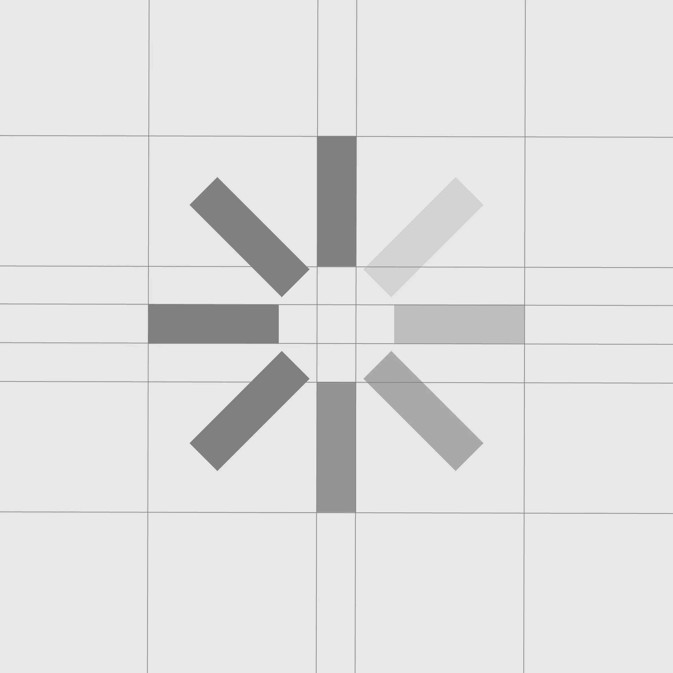
Concept 3
The Spark is represented as a loading screen symbol. Giving reference to digital learning and immersive technologies.
The concept represents the first thing a student will see before they load into a virtual immersive learning space using the AR/VR technology provided within the space.
Brand Elements
Typeface
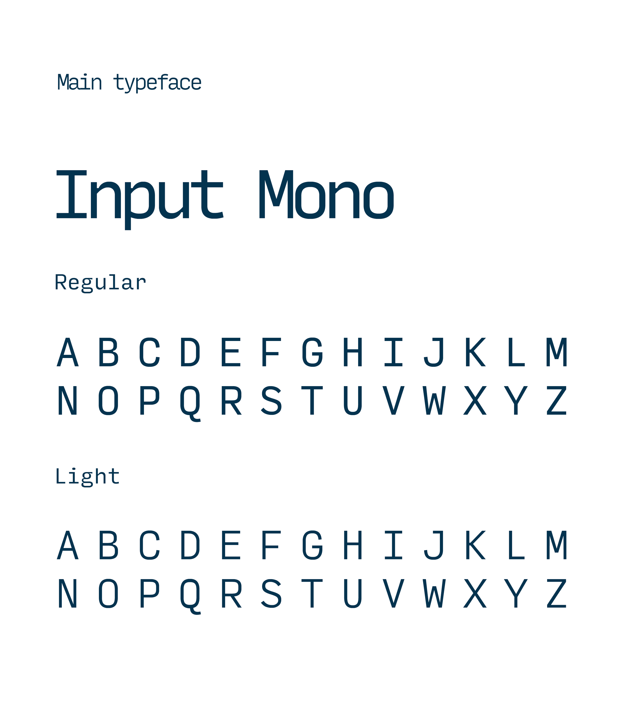
Input Mono
This typeface was chosen for its monospaced style. Its crisp edges and programming aesthetics finds inspiration in early computer consoles but looks towards a typographically rich future, where coding environments overcome technical limitations.
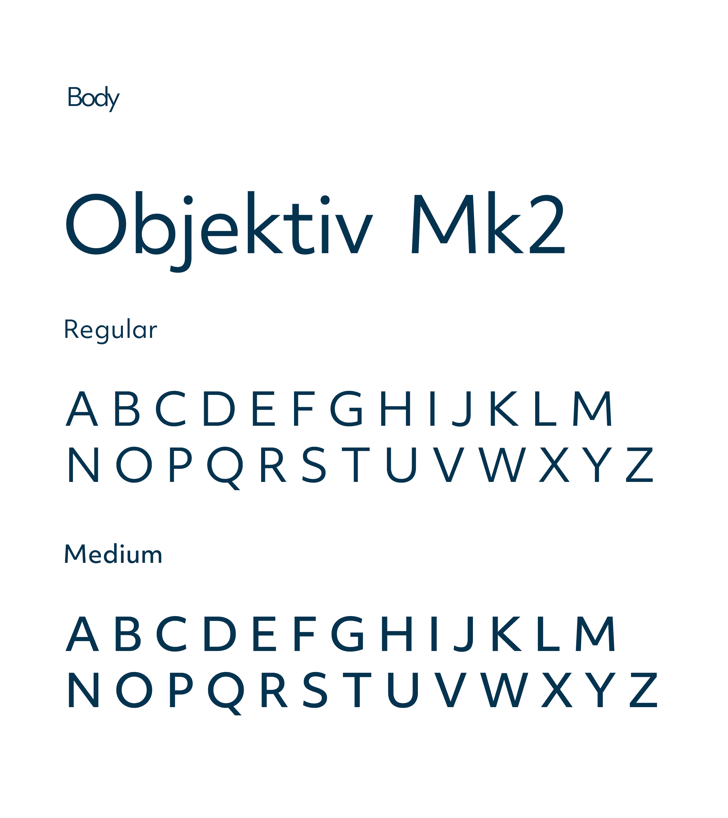
Objektiv Mk2
Objektiv is clean and bold, perfect for both headers and body copy. It takes a new look at geometry; it follows mathematical principles but remembers that it is a design to be used by humans.
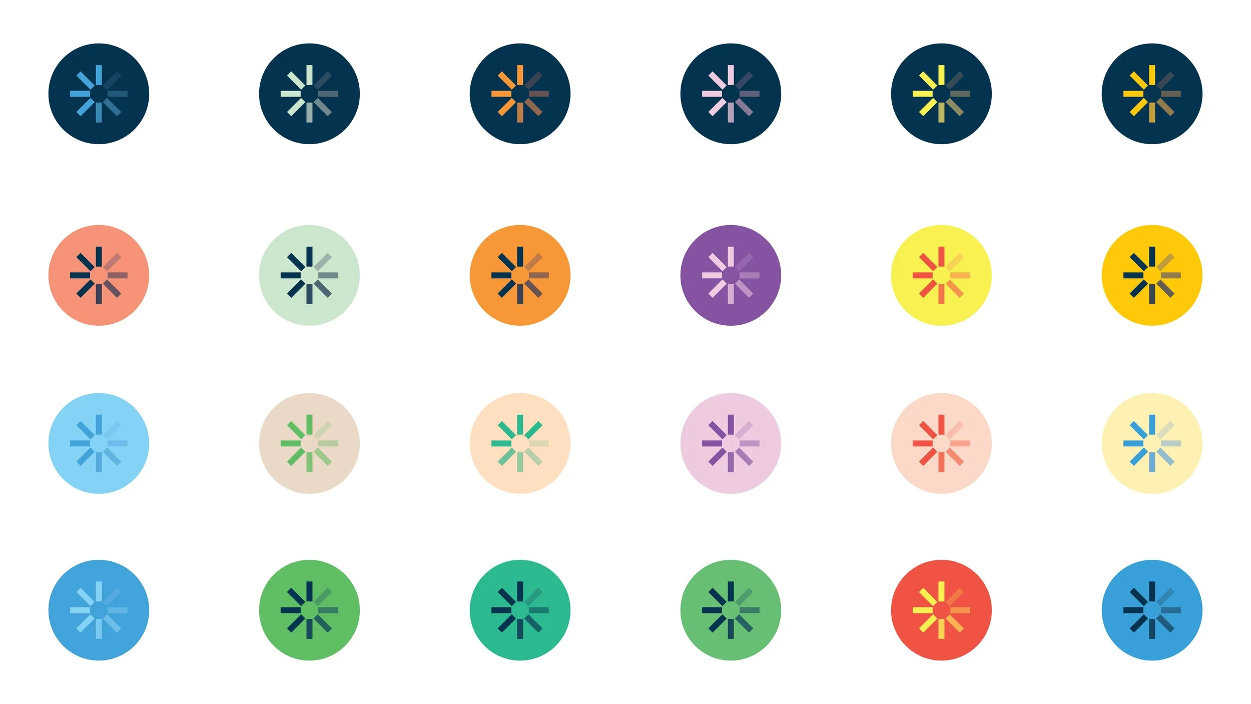
Colour Exploration

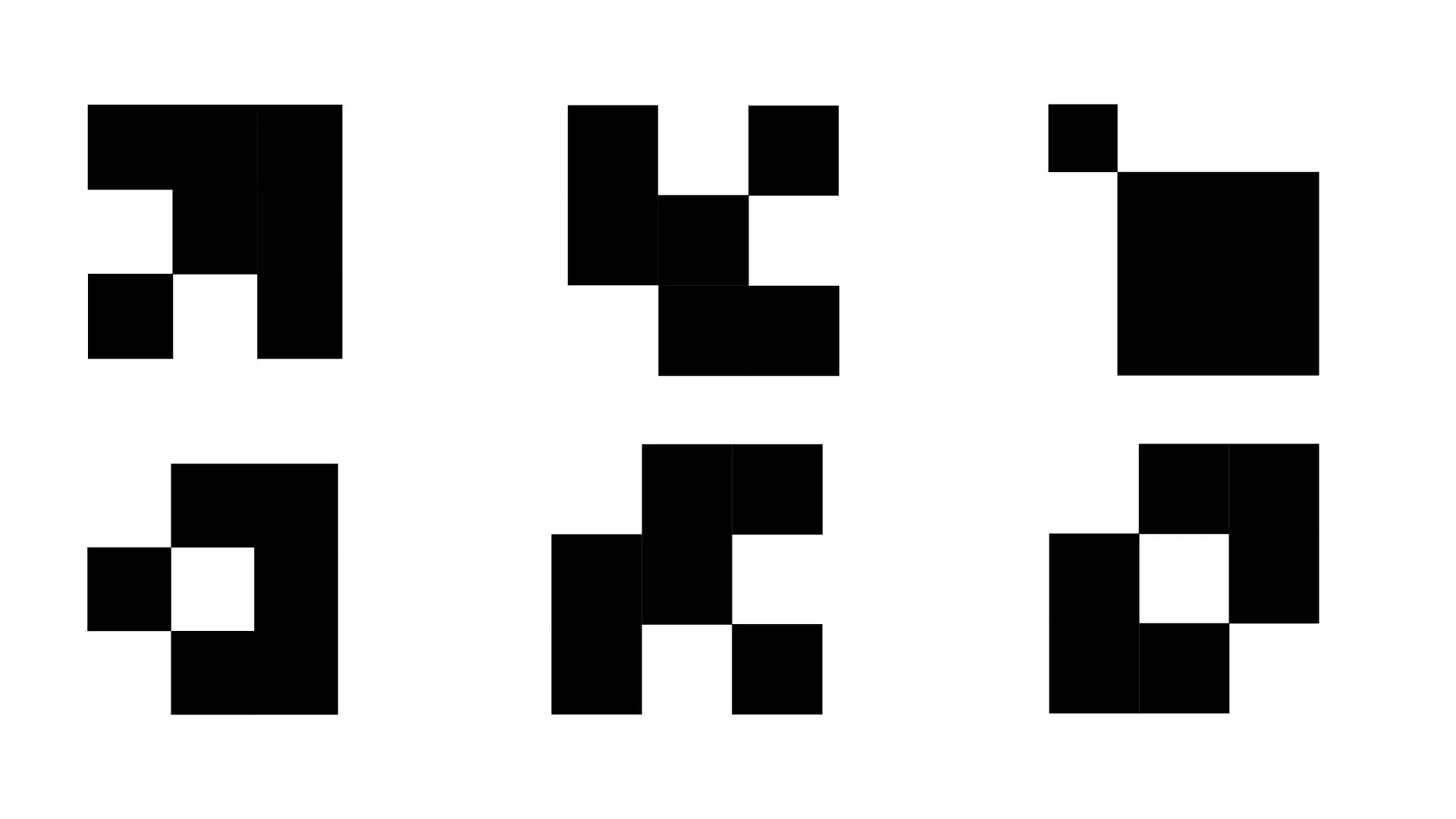
Pixel Grids
Pixel grids are a graphic feature that can be used as part of the artwork to create patterns or to house imagery.
They can be made large to more abstract, frame imagery or small to create patterns.